The leather jacket hanging in the vintage store caught my eye not because of the leather quality or the classic cut, but because of the single embroidered patch perfectly positioned on the upper left chest. A small aviation squadron insignia, expertly placed and proportioned. It looked like it belonged there, like it had always been part of the jacket's design.
That's the difference between patches that enhance a jacket and patches that just occupy space on it. After years of producing custom embroidered patches for everything from police uniforms to motorcycle club leathers, we've learned that placement and proportioning determine whether patches look professional or amateur.
The rules aren't arbitrary. They're based on how our eyes naturally scan clothing, how body proportions affect visual balance, and how different jacket styles interact with various patch sizes and placements. Get these fundamentals right, and your patches elevate the entire garment. Get them wrong, and even the highest-quality patches look like afterthoughts.
Understanding Jacket Patch Real Estate
Every jacket offers different patch placement opportunities based on its construction and intended use. The key is identifying the primary visual zones and understanding how they interact with human movement and body proportions.
The chest area is prime real estate for most jacket types. The upper left chest (wearer's left, viewer's right) is the traditional placement for name tags, company logos, and rank insignia. This position sits naturally above the heart and creates immediate visual hierarchy. The upper right chest works for secondary information like department names, certification badges, or decorative elements.
Shoulder areas demand careful consideration because they're highly visible but also subject to movement and wear. Military and public safety uniforms traditionally place unit patches on the upper arm, approximately 4-5 inches below the shoulder seam. This position remains visible when arms are at rest but doesn't interfere with natural arm movement.
Back panels offer the largest canvas for patch placement, making them ideal for large organizational logos, intricate designs, or statement pieces. The upper back, between the shoulder blades, provides maximum visibility while maintaining professional appearance. Lower back placement works for decorative elements but may not be visible when seated.
Sleeve placements work well for patches that need to remain visible during various activities. Fire departments often place department patches on the upper sleeves because they remain visible even when firefighters are working with their arms extended.
Size Guidelines That Actually Work
Patch sizing isn't just about what fits physically on the garment, it's also about creating visual harmony between the patch, the jacket, and the person wearing it. Patches that are too small disappear into the fabric. Patches that are too large overwhelm the garment and look amateur.
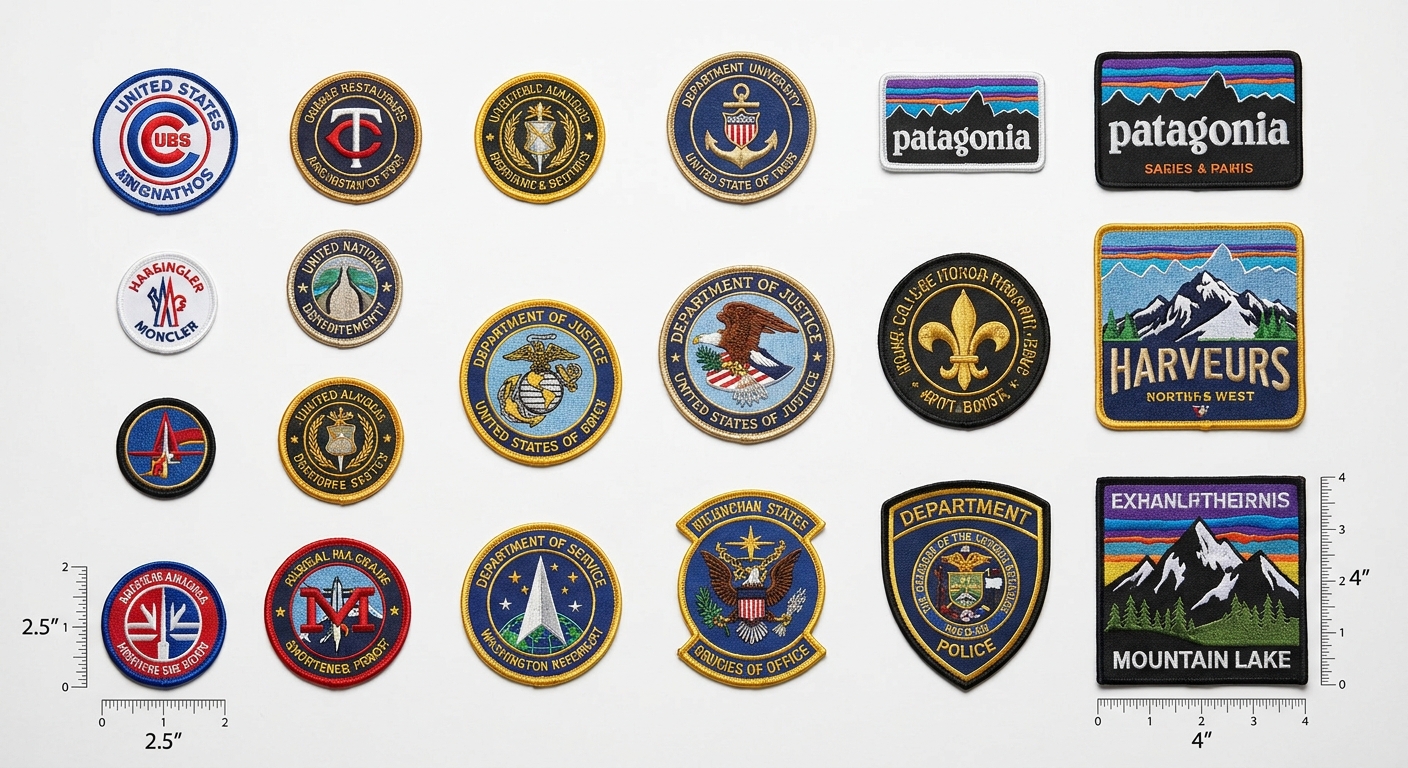
Standard chest patch sizing: For most business and uniform applications, 2.5 to 3.5 inches works perfectly for chest patches. This size remains clearly visible from conversation distance (3-4 feet) without dominating the jacket's appearance. Smaller individuals or fitted jackets often look better with patches closer to 2.5 inches, while larger builds can accommodate 3.5-inch patches without overwhelming the garment.
Shoulder and arm patch proportions: Upper arm patches typically range from 3 to 4 inches, taking advantage of the larger available space on the sleeve. The curved nature of the arm area actually makes slightly larger patches appear more proportional than they would on flat chest areas.
Back panel patches can range from 4 to 8 inches depending on the jacket size and intended impact. Large organizational logos or detailed artwork often work best in the 6-8 inch range, positioned centrally between the shoulder blades. Remember that back patches are often viewed from greater distances, so they can support more detail and larger text than front-facing patches.
Multiple patch considerations: When using multiple patches on a single jacket, maintain consistent sizing within each functional category. All chest patches should be the same size. All sleeve patches should match. This creates visual rhythm and professional consistency.
Placement Rules for Different Jacket Types
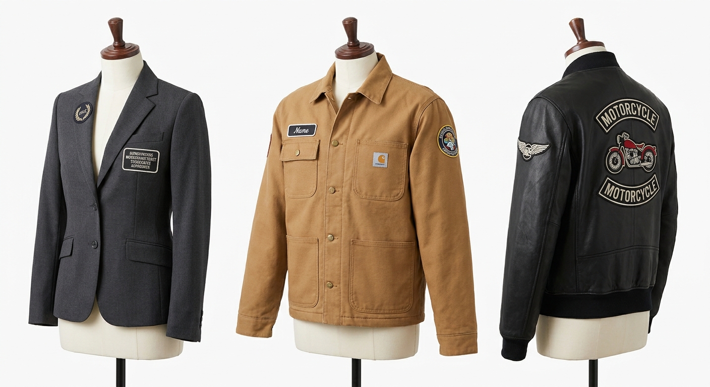
Business blazers and sport coats follow conservative placement conventions. Single chest patches work best on the upper left chest, positioned between the top button and the lapel edge. Keep sizes modest (2.5-3 inches maximum) and choose subdued colors that complement the jacket fabric. Multiple patches rarely work on business attire as they create visual clutter that undermines professional appearance.

Work jackets and coveralls can accommodate more extensive patch placement because function often outweighs fashion considerations. Chest patches identify the worker, shoulder patches show department or specialization, and back patches display company branding. The key is creating a clear information hierarchy. Name and primary identification on the chest, secondary information on sleeves or shoulders.
Leather jackets offer unique patch placement opportunities because the material itself makes a strong style statement. Traditional biker cuts work well with large back patches, small chest pieces, and sleeve patches that follow the jacket's seam lines. Modern leather blazers follow business jacket conventions with single chest placement being most appropriate.
Outdoor and technical jackets present patch placement challenges because of the complex seam construction and functional elements like zippers, vents, and pocket placements. The best approach is working with the jacket's existing design lines rather than fighting them. Patches that align with seams, follow collar lines, or complement zipper placement look intentional rather than random.
Denim and casual jackets allow for more creative patch placement approaches. The relaxed nature of casual wear supports asymmetrical layouts, mixed patch sizes, and unconventional placements that would look unprofessional on business attire. However, even casual placement benefits from underlying structure and balance.
Color Coordination and Visual Harmony
Patch colors should enhance the jacket's appearance, not compete with it. The most successful patch designs create visual cohesion between the patch, the jacket fabric, and any other design elements like buttons, zippers, or existing graphics.
Monochromatic approaches work well when you want patches to feel integrated with the garment. Navy patches on navy jackets, black patches on black leather, or tan patches on khaki work wear create subtle branding that enhances rather than overwhelms the base garment.
Contrasting approaches make patches more visible but require careful color selection to avoid clashing. White or light patches on dark jackets create strong visibility for name tags and critical information. Dark patches on light jackets work well for decorative elements that should remain subordinate to the overall design.
Coordinated color schemes use 2-3 colors that relate to both the patch design and the jacket color. A red, white, and blue patch can work on either navy or khaki jackets because the color palette includes complementary elements for both base colors.
Metallic accent considerations: Gold and silver thread accents can add a premium feel to patches, but they need to coordinate with the jacket's hardware. Gold thread complements brass buttons and warm-toned zippers. Silver thread works better with gunmetal or stainless hardware.
Technical Considerations for Professional Results
Backing choices affect both appearance and durability. Heat-activated adhesive backing works well for temporary or quicker applications. Sew-on patches provide a more permanent attachment and work better for high-wear applications like work uniforms or outdoor gear.
Thread density impacts visual quality. High thread count patches (3,000-4,000 stitches per square inch) create crisp, detailed images that maintain their appearance over time. Lower density patches cost less but may look fuzzy.
Edge finishing affects perceived quality. Merrow borders create clean, finished edges that resist fraying and give patches a professional appearance. Laser-cut edges work for simple designs but can look less finished on complex patches.
Size tolerances matter for multi-patch applications. When ordering multiple patches that need to align or match precisely, specify tight size tolerances (±0.1 inches) to ensure consistent appearance across all units.
Common Placement Mistakes to Avoid
Pocket interference happens when patches overlap or compete with functional elements like pocket openings, flaps, or zippered compartments. Always consider how patches will interact with daily jacket use. A chest patch positioned too low might interfere with pen storage in a shirt pocket underneath.
Movement restrictions occur when patches are placed in areas that flex frequently during normal wear. Shoulder seam patches can create binding or pulling sensations when arms are raised. Elbow area patches may affect arm mobility or create premature patch failure from repeated flexing.
Proportional errors make otherwise quality patches look amateur. Tiny patches on large jackets disappear into the fabric. Oversized patches on fitted jackets create visual imbalance that affects the wearer's overall appearance.
Asymmetrical layouts work in some casual contexts but generally look unprofessional on business or uniform applications. Unless asymmetry is intentional and supported by the overall design concept, stick to balanced, symmetrical patch arrangements.
Color clashing happens when patch colors fight with the base jacket color or create unwanted visual effects. Bright red patches on dark green jackets can create Christmas-tree associations that undermine professional appearance.
Planning Your Patch Layout
Before ordering patches, create a placement plan that considers the jacket's intended use, the wearer's body proportions, and any organizational requirements or style guidelines.
Measure twice, place once. Use tailor's chalk or removable markers to test patch positions before making final placement decisions. What looks good on paper doesn't always translate to three-dimensional garments worn by real people.
Consider viewing angles. Patches placed for optimal front-view appearance might not work as well from the side or during movement. Test patch positions with the jacket being worn and observed from multiple angles.
Think about layering. If jackets will be worn over other clothing with patches or logos, ensure the combined effect remains professional and readable. Competing visual elements can cancel each other out.
Plan for maintenance. Patch placement should accommodate normal cleaning and care requirements. Patches in high-wear areas may need replacement more frequently than those in protected positions.
Creating Professional Impact
The goal of any patch placement strategy should be creating professional visual impact that enhances both the wearer's appearance and the organization's brand image. This requires balancing functional requirements with aesthetic considerations.
Start with essential information: name, rank, department, or primary organizational affiliation. Place these elements in the most visible, traditional positions. Add secondary information in logical hierarchy, using consistent sizing and placement patterns.
Consider the viewer's experience when encountering someone wearing your jacket. What information do they need immediately? What creates positive first impressions? What reinforces the professionalism and competence of your organization?
Remember that patches are permanent visual elements. Unlike pins or badges that can be easily changed, embroidered patches become part of the jacket's identity. Choose designs, colors, and placements that will remain appropriate and attractive throughout the garment's useful life.
Custom embroidered patches can transform an ordinary jacket into a professional uniform that builds brand recognition and creates team identity. The key is respecting the fundamental principles of proportion, placement, and visual hierarchy while adapting them to your specific organizational needs and style requirements.
With our low 5-piece minimums and extensive customization options, testing patch designs and placements for your organization has never been more accessible. When patches are done right, they don't just decorate clothing, they create professional identity that people wear with pride.
The information below is required for social login
Sign In
Create New Account