

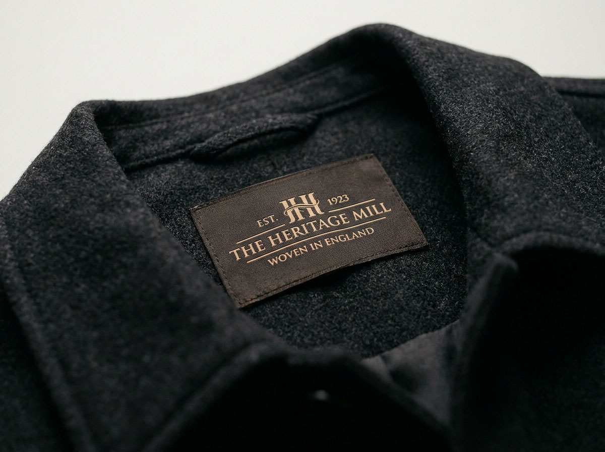
Heritage and vintage styles are having a huge moment right now. Brands across clothing, workwear, and accessories are leaning into classic mid-20th-century design. Think bold serif fonts, warm earthy colors, crisp borders, and the solid feel of a woven label built to last. This trend isn't just about nostalgia. Shoppers love the vintage looks because they signal real care, quality, and craftsmanship.
Recreating an authentic vintage look takes more than picking a retro font. It comes down to specific weave structures, thread choices, and design details. This guide breaks down what defines vintage woven labels, how to plan your design, and how to work with your supplier to get great results.
Why Vintage Aesthetics Work for Modern Brands
There is a simple reason classic branding works so well: labels that look established build instant trust. A garment with thoughtful clothing labels stands out on the rack, giving shoppers a quick visual cue that your product is well-made.
This approach works across almost every category. Whether you are launching rugged workwear, classic outdoor gear, or refined menswear, a vintage-inspired tag sets the tone. It isn't just decoration. It shows where your brand comes from and what you stand for. For many growing brands, updating the label is one of the easiest ways to elevate how customers perceive their clothing.
The Design Elements That Define Vintage Woven Labels
Authentic vintage tags rely on a few distinct design choices. Knowing these details makes it much easier to brief your supplier and get exactly what you want.
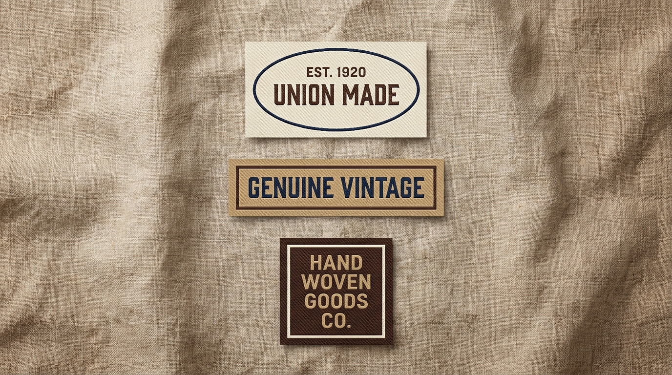
Typography. Classic labels used compact, sturdy lettering like condensed serifs, slab serifs, or simple scripts. Early looms had limited detail capabilities, so letters were often spaced closely together. While modern looms can handle fine details, tight serif fonts still carry that genuine retro feel.
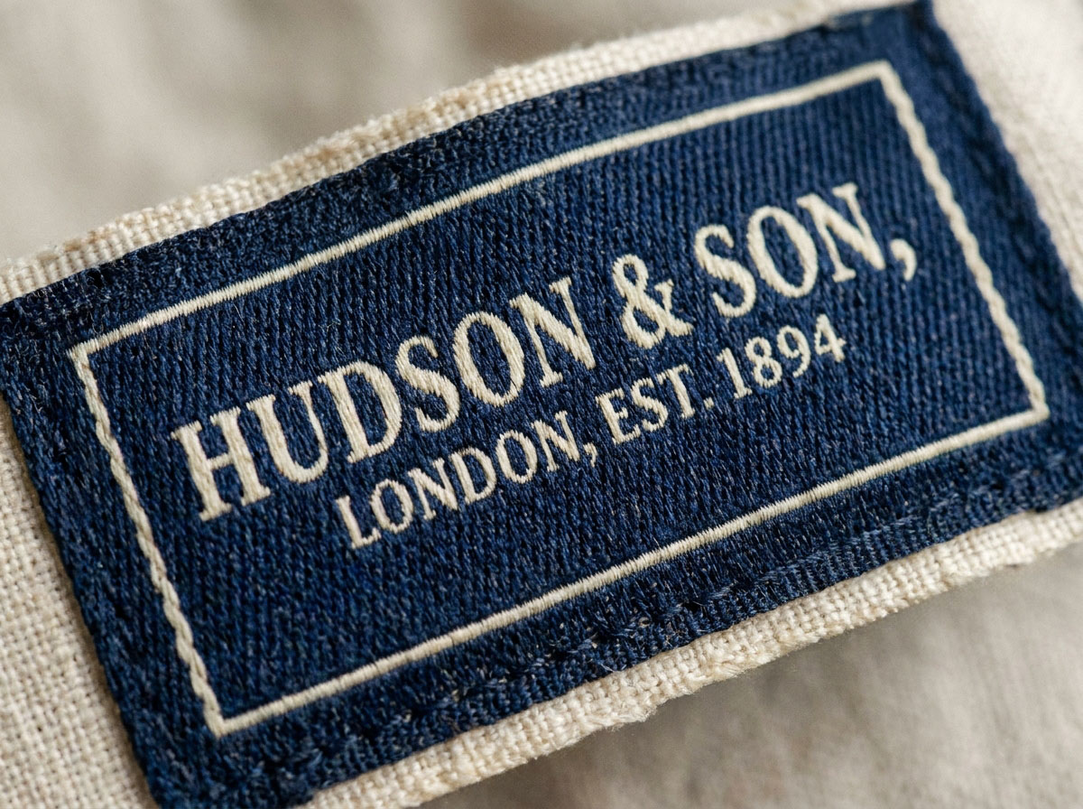
Color palettes. Older labels relied on simpler, softer color combinations. Instead of bright modern shades, go for rich, slightly muted colors. Black backgrounds with cream or gold text, deep navy with red and white, or tan with warm brown all work beautifully.
Borders and layout. Standard vintage tags almost always featured framed layouts. Adding a fine border around your logo grounds the design and gives it a clean, finished look. Centering your main brand name with smaller text below for origin or sizing creates a timeless, balanced aesthetic.
Texture and ground. The fabric itself carries personality. Retro labels were often woven on natural fiber backings, giving them a soft, touchable texture. A smooth, shiny label feels modern, while a textured woven background feels rooted in tradition.
Choosing the Right Weave Structure for a Retro Look
Matching the right weave structure to your concept is essential for hitting that classic vibe.
Damask weave is the industry standard for sharp detail. It offers a smooth surface with high resolution, making it ideal for intricate logos or small text. Even though damask is a modern production method, using it with classic artwork gives you the best of both worlds: clean lines and a retro aesthetic.
Satin weave has a glossy finish and a smooth feel. It works great for modern luxury lines, but it usually feels too slick for authentic heritage apparel.
Cotton ground weaves are perfect if you want true material character. Woven labels made on cotton backings have a soft, matte finish that feels genuinely classic. The slightly thicker weave reinforces an authentic, crafted feel. Our Woven Cotton Logo Labels are a great choice if you want natural texture paired with vintage artwork.
Color Depth and Thread Selection
Thread selection makes a huge difference in how authentic your label looks. Standard synthetic threads are often very bright and saturated, which can make a classic label look a bit too new.
To keep things looking timeless, pick softer Pantone colors instead of harsh tones. Use warm cream instead of bright white, soft gold instead of yellow, or muted navy instead of bright blue. These subtle color choices give your label an authentic, aged feel without looking artificial.
How to Brief Your Label Supplier for Vintage Results
Sharing clear details with your supplier saves time and helps you get perfect samples right away.
Reference labels. If you have physical examples or photos of vintage tags you love, send them over. Seeing actual fabrics, colors, and textures gives your supplier a clear direction.
Exact dimensions. Classic neck labels were typically rectangular, running around 1 to 2 inches wide by 0.75 to 1.5 inches tall. Sharing exact size requirements ensures your proportions look balanced once woven.
Attachment method. Decide how your label will attach to the garment. Center-fold tags are the classic choice for necklines, while flat or end-fold tags work well for hem tabs and side seams.
Edge finishing. A standard cut-and-fold finish keeps edges soft and clean. It gives you a clean result without adding unnecessary bulk. Our Custom Woven Logo Labels come with multiple fold and edge options, so you can easily match your vintage reference.
Production Minimums, Lead Times, and Sample Process
Creating retro woven labels does not require massive order quantities. Production minimums start at just 5 pieces, making it easy to test custom labels on actual samples before placing a large order.
Standard production takes about 5 to 8 business days. Ordering a pre-production sample adds about 5 to 7 business days, which is well worth it to check colors, textures, and folds in hand. Testing a physical sample first ensures your final batch turns out exactly as planned.
Getting Started
Taking time to plan your typography, color choices, and weave materials pays off in a label that looks authentic and elevates your clothing line.
If you are updating your brand or launching a vintage-inspired collection, we are here to help. Request a free quote online, share your design ideas, and our team will guide you through the process step by step.
The information below is required for social login
Sign In
Create New Account